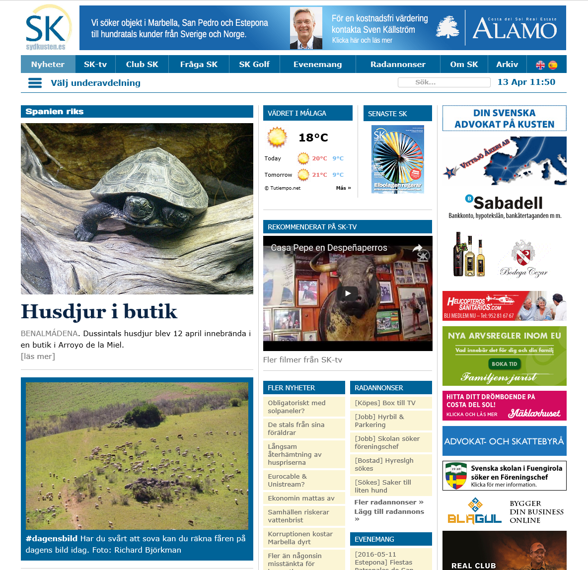
Sydkusten Redesign

The largest Swedish newspaper on Costa del Sol, Sydkusten, needed (really needed!) a new design. The previous design had been created at some time in the nineties. It was quite a feat that the site was still running on the same system more than a decade later, but now that mobile users being an ever increasing market share, the Björkman brothers decided to renew the whole layout. In april 2015, Google adjusted their search algorithm to punish sites that are not mobile adapted in mobile search results. Since then, if your business is local and suitable for mobile searches, you risk losing clients if your site is not mobile friendly.
Since Webcosta has been working together with Sydkusten for many years, they gave us the confidence to build the new site.
It’s a bit of a challenge to build a design for a site the magnitude of Sydkusten. The site has got many subsections and an enormous amount of content. The mission consisted in creating an easy to use design with easy access to the most commonly used content – all in a modern, sober graphical design with space for many ads.
The new site was launched September 1, 2015 and the response was unmistakable. Traffic rose 18% the first month and visitors stayed 30% longer on the site than before. Half a year later, in March, the result was even more impressive, boasting 58% more visitors than March 2015.
The effect on mobile usage was spectacular with number of visitors on mobile phones tripled, compared to the previous year!


